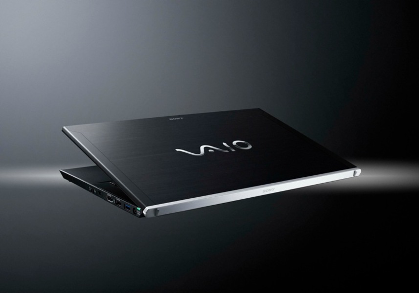
Sony's latest ultraportable laptop is stunning. It's beautiful and lightweight, with a classy metal chassis and impeccably tasteful trim. It has a powerful i7 CPU, 1600x900 13.1" display and a lightning-fast SSD. It's half a pound lighter than the competition. And it exemplifies everything that is wrong with its creator.
Unfortunately, it also costs much more than the Mac and, as reviewed by Christopher Null for Wired, has "disastrous" design flaws. The trackpad's in an odd spot. It's got a loud fan. It's loaded with junkware, because paying two grand for a laptop doesn't get you a system that hasn't been sold to someone else. It's sold as the VPCZ214GX/B — alcohol must have been banned at the ad agency's resulting all-nighters just to ensure everyone could say each model's full name.
These characteristics may reduce the appeal of the laptop, but the most interesting flaw--the one that is so telling about its designer!--is one that many users won't even notice: the keyboard. Null says it has "almost no travel". This hardly trenchant criticism, especially if you're used to island-style keys. Sony's is just a new design, different from the others.
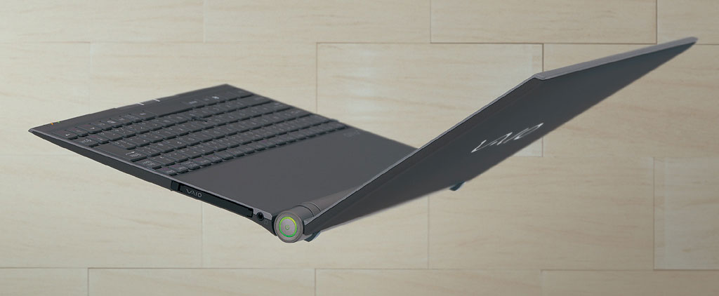
And yet this is it. The criticisms leveled at Acer and Asus—that their ultrabooks are imitations of the Air—aren't leveled at Sony, because it pioneered the form factor and the keyboard that goes with it. Behold the Vaio X505, a laptop released in 2005:
Now, this was not a very good computer, with poor performance and battery life. But it got a lot right, especially in how it dealt with the ultraportable-laptop keyboard problem. Before then, chiclet keyboards were evil, rubbery things. But that changed at about that time, and Sony was in the vanguard.
Since then, the X505's "island-style" keyboard's been so successful that you can walk a store and not see a machine that doesn't have one. Apple even uses them on its desktop keyboards.
But now, for some reason, Sony found the spec sheet that said "laptops: fix big keys" and set out to solve the problem it already solved 6 years ago.
The computer keyboard isn't a place where radical UI design changes are desirable. To extend the marketing metaphor, it's like the typeface of a book. You're stuck with the same old alphabet, in the same configuration, and your job is to preserve its usefulness while investing the work with with a certain character. The smart choice is to design something good and stick with it.
But Sony does not. The changes to the chiclet keys in the Vaio Z, however slight, show that it can't even refine its own winning ideas. It's as if Sony was using Helvetica before almost everyone else, then switched to Arial when the world followed suit.
Years ago, it nailed a good balance of size and resistance, minimizing protrusion from the bed without losing the tactile sensation of travel. Then it forgot.

These are just a few of its ultraportables from recent years. Though all of them retained elements from it, none of them were really iterations from the original X505. Even the newer X from 2009 (right), which was that year's "response" to the Air, was completely different to the 2005 original in respects other than weight and form: it was plastic, had a very fast SSD, and was reasonably-priced.
All of these were nice, high-end computers that could have become great designs if they'd stuck with them. But Sony rarely iterates, even when it's onto something good. Everything is a one-off. It treats a billion-dollar business the way a microbrewery treats ales with silly names.
Instead, Apple iterated the original design, then kept at it, even though the original MacBook Air was a poor performer. (It's easy to imagine Steve Jobs having to be argued down from launching the MacBook Air at $2500 with the high-end solid-state configuration as the only option -- If we launch the cheap one, it'll be no better than the junk from Sony.)
But persisting with the Air, even if it was slow and expensive, yielded dividends as the price of high-end configurations fell. By 2011, Apple ditched the hard-drive models entirely, reduced the solid state option to $899, and turned the Air into one of the most successful laptops going.
Apple isn't the only company that persists with a good design, either. If you want an ultraportable laptop that's Windows or Linux-friendly which works better than the Z and isn't outrageously expensive, look no further than the Lenovo X series.
Sticking with it
At a recent event I attended, someone involved in marketing said that Apple's success is founded on it creating substantially new designs every year to keep everyone keeping up. In his view, Apple ownership is about getting the latest thing to impress people.
This was intended as criticism of the iPhone 4S, which is indistinguishable by sight from the previous model. His belief was echoed by others: the unchanged design was obviously going to fail, was a sign of internal paralysis at Apple, Tim Cook not being a visionary, and so forth.
Earlier, one columnist offered similar thoughts following the product announcement, suggesting that the iPhone 4S's unchanged design would cause Apple's stock to tank. Over the coming days, however, it outperformed the market.
It's weird that a company under such constant scrutiny is misunderstood like this, often by people who have been watching it for years. Isn't it obvious that Apple rarely changes its designs?

Check out these two iMacs. The one on the left is from 2007, and the other is the latest model. They're more than four years apart.

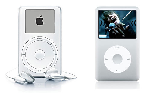
Here's the first and the latest iPod. While they're not identical, bear in mind that nine years passed in the interval, and Creative Labs' MP3 players don't look much like this anymore.

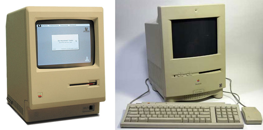
Here's a Mac from 1984 and one from 1994. Though Apple made all sorts of other desktop towers and pizza boxes in this period, this popular design saw more than a decade of refinement.
I imagine that Apple is delighted to see rivals convinced that every year's model is different to the last one; talk about a reality distortion field. Companies like Dell and HP will chance across good design every so often, but companies like Sony make good designs then abandon them intentionally because they're blind to their own good design choices.
Taste and Design
Taste and Design: the two words distinguish consumers from producers. We taste, they design. But designers also have taste in their own work, and what the Vaio Z's designer doesn't get is the difference between good taste and good design.
Taste often describes flavors, appearances and forms; it blends into fashion, which spins as fast as people can spend their money. Even the classics shift as priorities change; something may be tasteful but irrelevant. Design, however, also concerns itself with function. If a design fails to encompass good taste, the result will be ugly. But if taste fails to encompass good design, it'll be useless.
Talking about another Sony laptop that buries functionality under tasteful appearances and spec sheets, it's not hard to see the point in all this.
Together with the marketer's remarks, however, this got me thinking about how little Apple cares about taste, a quality almost universally attributed to it.
It will even embrace tastelessness in pursuit of what it regards as good design: if you assume otherwise, perhaps you're forgetting about all that brushed metal, pleather and baize stretched over iOS. Some of its most heavily-marketed user-interfaces are almost as tasteful as those in games you can buy in jewel cases at Wal-Mart.
Unlike the menu system of 1001 Card Games, however, this is not to say they are badly designed. Bad taste can illustrate great art and design, even in the most mundane contexts. Cheesy textures, for example, can make an app's function clearer in screenshots, without having harmed the functionality of the apps.
The ThinkPad, from IBM and Lenovo, is another good example, with gaudy purple and red trim serving a design so durable that even a complete change in corporate ownership couldn't change it.
On the other hand, Sony's not alone in proving that good taste is no guarantee of good design. See Windows Phone 7, for example. It's beautiful. It's in excellent taste: minimalist, smoothly-animated, yet bold and experimental. But when we ask why something so well "designed" is failing to catch on, we've already pulled the wool over our eyes.
Apple competitors are obsessed with copying Apple's tastes without copying its central design habit, which is solving a problem and then refining the solution until the problem changes.
And that's the difference between the Vaio ultraportables and the Air: Apple stuck with Sony's solution and refined it, whereas Sony threw it the trashcan in 2005, 2008, 2010, and (spoiler!) 2012.


1 comment:
You are sharing a particularly decent article here. It is a significant and factual article for us. Thankful to you for sharing an article like this.Macbook Air 11 A1370 Parts
Post a Comment